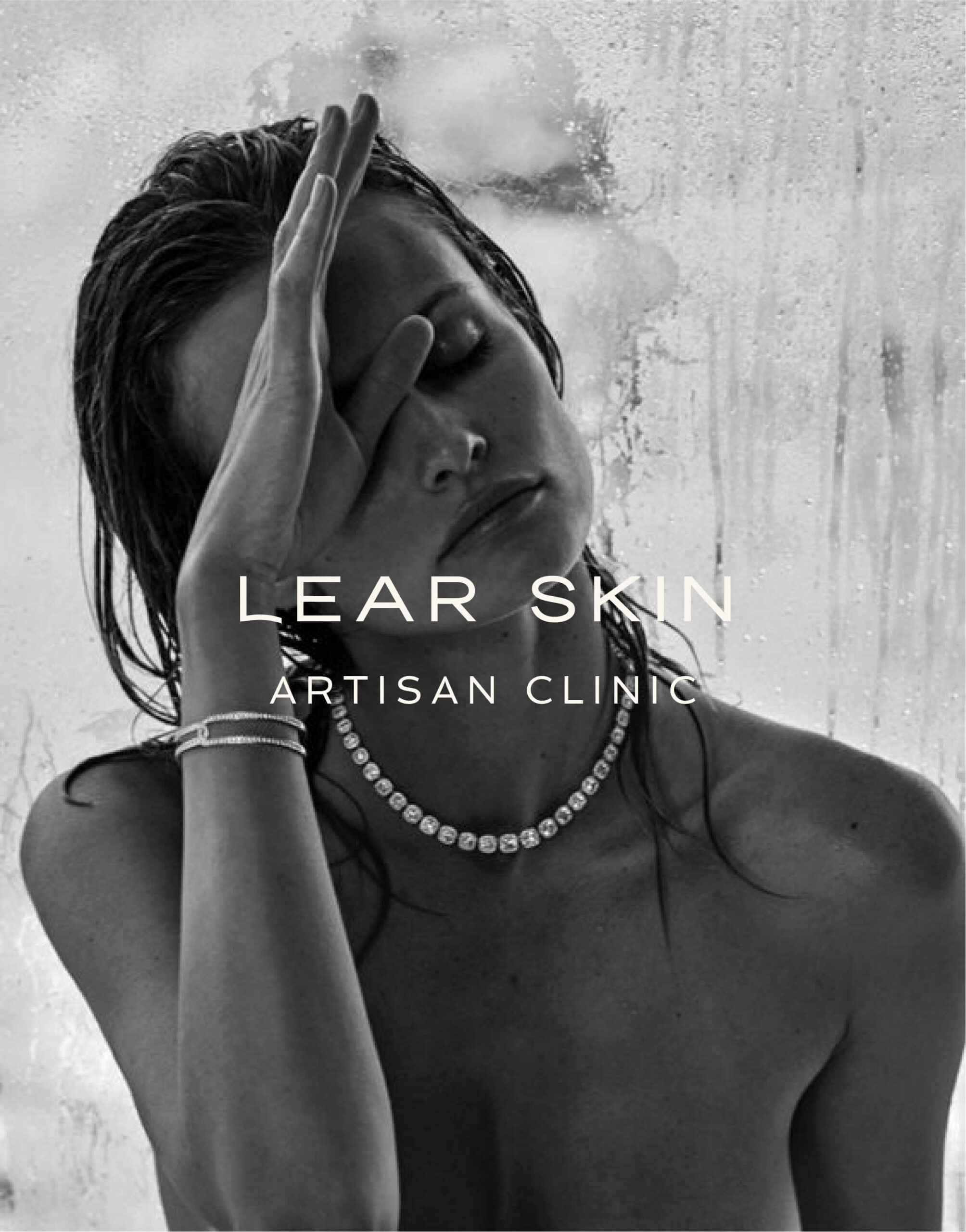
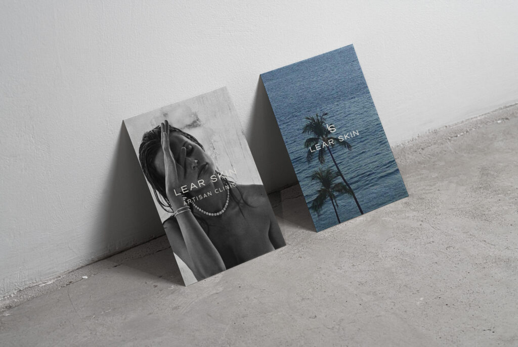
Lear Skin was envisioned as a modern skincare clinic rooted in calm clarity and quiet luxury. Though the business never launched, we were brought in to build its brand identity — a minimal, beach-inspired system that evokes the feeling of soft mornings, clear rituals, and expert care. The palette, typography, and layout were designed to feel weightless yet grounded, offering a glimpse into a serene and elevated skin experience that still lives on through the brand.
Lear Skin
BRAND IDENTITY
Lear Skin was envisioned as a modern skincare clinic rooted in calm clarity and quiet luxury. Though the business never launched, we were brought in to build its brand identity — a minimal, beach-inspired system that evokes the feeling of soft mornings, clear rituals, and expert care. The palette, typography, and layout were designed to feel weightless yet grounded, offering a glimpse into a serene and elevated skin experience that still lives on through the brand.
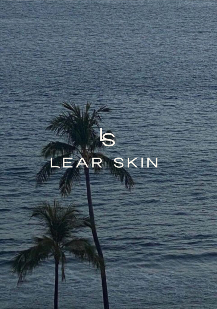
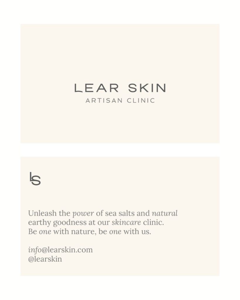
The rounded “L” in the Lear Skin logo was a subtle but deliberate choice — designed to soften the overall mark and evoke a sense of calm and approachability. In a category often dominated by clinical sharpness, the gentle curve adds a human touch, suggesting care, ease, and trust. It balances the minimalism of the rest of the wordmark while reinforcing the brand’s focus on skin that feels supported, not scrutinized.
“MOK just gets it. They turned my scattered ideas into a brand I’m obsessed with — clean, thoughtful, and beautifully done. Can’t recommend them enough.”
[Founder, Lear Skin]
We curate brands that feel as good as they look. Ready for your idea to come to life?

A business can have an exceptional product, a brilliant team and a very clear idea of what it stands for, but that clarity only gets you so far if nobody outside the company can see it. This is where creative tends to be misunderstood. It is still often treated as the layer applied once the […]
MOK’HOUSE operates as a creative production house, connecting strategy, design, content, production, music and digital capability through a flexible project-led model.

A case study on how MOK’HOUSE used Meta Ads to help Phoenix Performance grow a high-performance athlete program through strategy, creative testing and long-term optimisation.
Indigenous procurement is more than a policy requirement. Discover how genuine partnerships, cultural understanding and long-term collaboration create lasting value for organisations, communities and the creative industry.